How much income equality is there in London?

Data available on the London datastore
In this analysis, I am taking a look at how pay in London has changed since 1997. The data takes into consideration time, gender and whether staff work full-time or part-time. The aim is to establish the trends over time answering questions of whether pay increased proportionally and if there is there more equality.

The first piece of analysis takes us through the change in pay over the 23-year period. Since 1997, average pay across all of London has increased from £12.19 to £23.97, a rise of 97%. It sounds great, but let’s how it looks between men and women. (Average refers to mean)

This graph is quite clear, the blue line representing men sits above the average hourly pay rate in green, then there’s a bit of gap before the red line representing women’s rate. All three lines follow a similar positive, upward trend, but what’s less noticeable is that the blue line and the red line are growing slightly further apart. Despite the gender gap being £3.81 at the start, it has grown to £5.84. An extra couple of quid each hour in a 40-hour week equates to over four thousand pounds a year.

Is there a difference for men vs women at the top and bottom?
Let’s see what it’s like in the 10th percentile vs the 90th percentile. Firstly, men vs women at the top. There’s quite a gap and it doesn’t seem to be closing. This could be because women at the top are paid less, it could also be because women in high-paid positions.

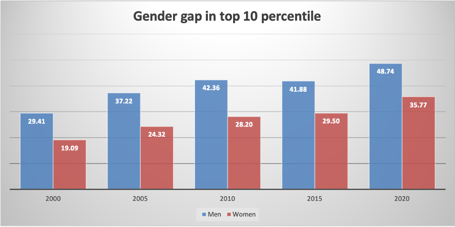
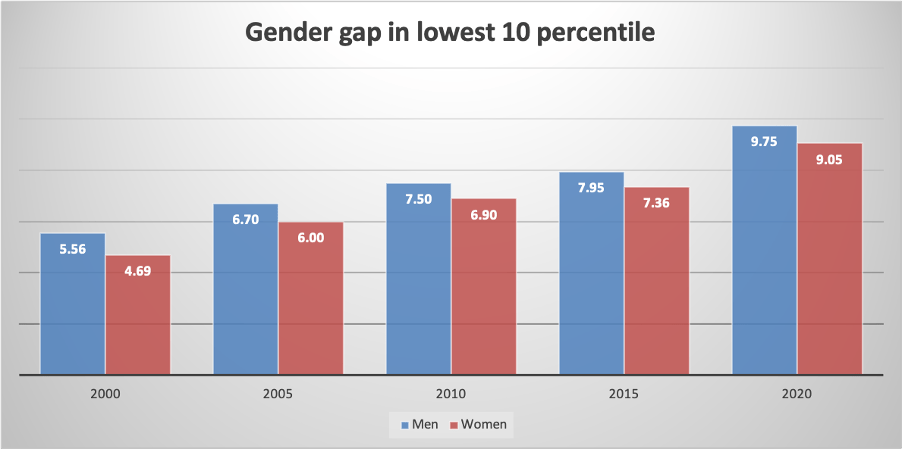
There is a lot less difference amongst working-class employees. See in the next bar chart that men and women are a lot closer in hour rates, but significantly, men are still earning more than women. So it seems that women can’t catch a break, they’re earning less at the top and the bottom.

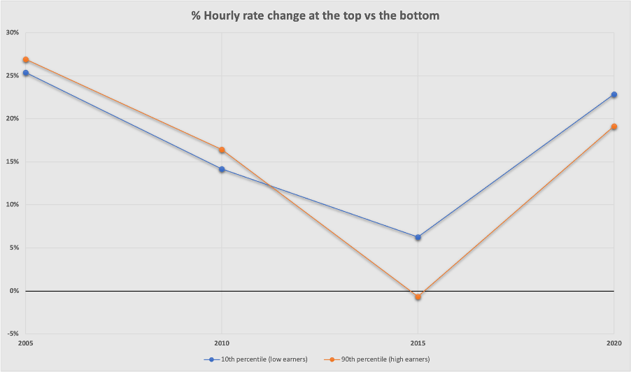
Comparing pay rate change for those at the polar opposites of the pay scale
The graph shows the percentage change in pay every 5 years for the higher earners and lower earners. So in 2005, everyone got at least a 25% increase in pay compared to their 2000 wages. Those in the 90th percentile had a salary decrease of 1% in 2015, otherwise, the rate of pay has increased in line with those in the lowest 10 percent. 
A 15% increase on £7.50/hr is £1.13, the same increase for a higher earner of £30 is £5.25. So whilst pay is going up at the same proportion, the rich are getting much larger wage hikes.

What about between genders, is there more parity in salary for men or women?

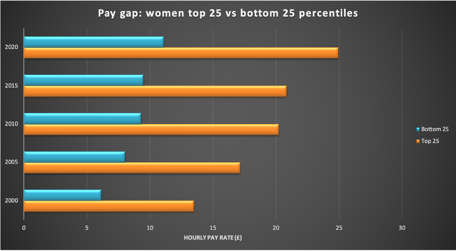
These charts look very similar. The top one shows the women earning in the top quartile (orange) vs women earning in the lowest quartile (blue) and the second chart is the same for men.

So regardless of gender, the gap between the higher and lower earning workers remains.
In fact the charts would suggest a growing divide between the higher-paid and lower-paid workers in London, with the orange bars nearly doubling in size while the blue bars increase about a third.

Have things changed in the last 5 years?

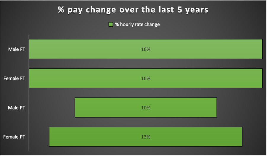
When considered by the percentage change, men and women in full-time employment have had an equal rise in pay rate over the last 5 years at 16%. An equal pay rise looks promising, but it should be noted that women are coming from a lower starting point, so to get to a point of equality, the pay rises would need to be greater than men’s – which is exactly what has happened with part-time employed staff, where women are gaining some ground. This needs to be larger and more consistent in the future to achieve parity.

In conclusion, are we doing better?
Pay for all has increased over the past 23 years, as you would expect when factoring in things like inflation, however the divide between men and women doesn’t seem to be diminishing. Women need to see a higher year-on-year increase than men to gain equality.
Pay is increasing at a similar rate proportionally for both low and high-paid workers, however this actually results in a growing chasm between the two.
So in a society where we are regularly fighting for awareness, social justice and fairness, we are not making enough ground to fight financial inequality.

Share this post on Twitter

firas ur-rub firas ur rub firas urrub data analysis gender equality men women pay

Giving blood in the UK

Bzzz vibrates my phone. A text from blood.co.uk. Thank you so much for donating. Your donation has now been issued to Hammersmith Hospital”. A positive way to start the day knowing that something you did has helped someone, somewhere.

Should I give blood? It is perhaps not a thought that crosses the mind of most.
For me, it was simply a conversation with someone who had donated theirs which sparked the idea in my head. The idea that I, as a healthy adult with no known erythropoiesis issues, should part with 470ml of red fluid once every three months and that red fluid would be pumped into the body of someone in a less fortunate situation. But you don’t know them, you don’t care about them, so why do it? Well, it is not just about the person on the other end. One day, you or someone close to you will very likely need extra blood, so donating now is merely saving up in advance.

Selflessness. Giving a part of your human self is a rather kind thing to do and we aren’t all that nice, but I have to confess I get satisfaction from it as well. Knowing I have supported a patient with cancer, anaemia or undergoing surgery feels good. Receiving that text about who gets my donations feels good. And again, if I give mine today then I hope life returns the favour when I need it. Plus, they have a bowl of the Club chocolate bars. So perhaps it is not all that selfless after all.

In the UK, the NHS operate a national blood donation service. Donations are made on a voluntary basis with no compensation and keeping up with the demand for supply is therefore not easy. According to their website, they need: 400 new donors a day to meet demand; more ethnic diversity in donors and; priority blood types like O negative. You can find out more information and register here: https://www.blood.co.uk/why-give-blood/

What is the blood donation procedure?

Personally, I do not like needles and whilst the mental thought of intravenous cannulation is enough to make me as pale as Casper the friendly ghost, I muster the courage to overcome my dislike (by looking away). The NHS blood operation is smooth. The website makes it easy to navigate and book an appointment, and it even tells you how far away the nearest donor sites are. I have visited more than one blood donation centre and the staff were always well prepared and well equipped. 
First you’ll complete a questionnaire and read the information leaflets while sipping on a pint of water or squash.
Once you’ve had a moment to relax and settle, you’ll be taken into a room for a quick health screening and to check your iron level with a drop of blood from finger prick. As an aside, I know someone who discovered they were anaemic and ended up in hospital. Slightly amusing that they went to give blood and ended up needing it.
The next stage is the donation. You will lie back on a comfortable bed, hand over your least favourite arm, and the donor centre staff will sort out the rest. Once the blood starts flowing, it takes about 5-10 minutes to fill up the bag. This is a good time to read an e-book or catch up on your social media feed while doing the signposted muscle tensing exercises to enhance blood flow.
The best part comes at the end – the refreshments in the recovery area. You sit here for a few minutes to make sure all is well and are invited to have a cup of tea, squash or biscuits and crisps.

And they are open with covid-19 measures in place.

Animal rescues in London, taking a look at the numbers

Dataset taken from the London Datastore (January 2021)

For data available since 2009, London Fire Brigade (LFB) have been publishing records on animal rescues in London. A total of 7,224 incidents have been logged. The animals in question can be found trapped in cars, stuck up trees, having fallen lakes amongst other unfavourable situations. Let’s find out what animals have been rescued and where.

Where have animals been rescued in London?

Firstly let’s take a look at which boroughs and areas have had the most problems. The messy pie chart below shows us that there is a quite an even spread across the capital. No one borough or area stands out as having the most trouble with their pets.

Pie with total incidents since 2009 by borough

What time of the year are there more rescues?

The expectation is that there will be less activity in winter, when animals are on the move less. This is backed up by the numbers and the graph below which shows us most calls are made in the summer months, between May and August, presumably pets spend more time outside at this point. Over the last 11 years, July was the most active month, and there were 917 callouts. Conversely, the cold weather of February could be a factor in keeping incidents down below 400 in the same period.

Graph showing animal rescue incidents by month

Which animals need saving the most in London?

So let’s have a look at what is being rescued by the LFB. In the colourful treemap below, the larger the rectangles the more incidents. Cats, cats, cats. Nearly half of all incidents involve cats and a deeper dive into the details unsurprisingly points to them finding themselves in high places, with 600 records relating to “tree” and 450 incidences of the word “roof”. The second and third largest rectangles belong to birds and dogs. The most exotic animals logged were a tortoise in Kingston and three lizards.

Treemap showing which are the most commonly rescued animals

Over time, have some animals become more popular?

Below is a table showing the number of incidents for different animals over the 11 year period. Notice how during the period, rescue numbers remain steady for many animals. Bird calls have increased by 142%, whereas dog incidents are down 44% since 2009. So does this mean birds are more popular pets than dogs? There are lots of factors at play, but realistically, it probably means the pigeon population in London is thriving and dog owners have become steadily more careful.

Table showing a count of animals rescued by year by LFB

What has this told us about animal rescues in London?

In conclusion we have established that calls are placed to LFB from all over London. Cats cause the most headaches and the warmer the weather, the more chance of them being stuck up a tree!

Analysing animal rescues in London

firas ur-rub firas ur rub firas urrub animals animal welfare RSPCA

Farming

Farming is typically the practice of raising animals and growing crops in large open fields, but it has evolved beyond that and it needs to evolve further.

Turkeys on a farm in Mastuj (2019)

I visited Iceland in 2012 and a tour guide made a point of drawing my attention to the bananas growing in a greenhouse, something that has stuck with me since then. Around 80 years ago, Iceland started growing the fruit themselves and while it is not produced on a large scale anymore, bananas are still grown there.

The idea that an exotic fruit farm could exist in an country whose capital has average temperatures of 1-2ºC in winter is exciting. Of course despite the coldness, easy access the geothermal energy made this an affordable option. Creative and innovative opens up opportunity in farming. Take for example the Netherlands who, despite being the 134th country in the world when ranked by area, are the second largest exporter of food. How do they do it? Through years of research and development they have refined their farming techniques. They boast greenhouses with rows of healthy crops growing fifteen metres tall, water-saving techniques and limited pesticides being employed. They supplement animal feed with waste by-products. It’s refreshing, and importantly they are maximising the limited space available to them.

Compare this with efforts to destroy rainforests across the globe in favour of farmland. What if they built upwards instead of sideways? The vast palm oil plantations in South-East Asia would argue they cannot help but take up more land, but that destruction of habitats is another story.

The world population continues to grow and as a consequence the demand for food rises with it. We need to advance our farming methods before we run out of land to expand into because there is nothing worse than losing the natural beauty of our planet.

Reykjavik (2012)

Sustainability

The importance of tourism in holding up economies cannot be understated. The amount of wastage produced in running the tourism industry cannot be understated.

Everywhere in the world it seems to be a problem. Food, plastic, water are overused.

Food in particular is discarded in bulk without apparent consideration for the impact chain of events leading to it landing in front of a patron. The land, the toil, the emissions and the lives.

Plastic-free alternatives are essential for maintaining our planet. Single-use straws and excessive wrapping are examples of unnecessary luxuries. Sustainably sourced products can replace wastage and emissions.

Recycled goods and reusable goods have to become more widespread in society. Reduction of consumption is achievable.

An analysis on Covid-19 cases in London

A quick analysis of Covid-19 data obtained from the London Datastore (December 2020)

London entered into Tier 4 lockdown on Sunday 20th December 2020. Let’s take a look at the cases across Greater London and see if the data tells us anything

Data is available since 11 February 2020 and runs through to 22 December 2020. The first graph shows the number of confirmed coronavirus cases recorded each month with a running total represented by the line. In March, the government began ramping up their testing infrastructure, with 10,000 confirmed cases identified in London alone (see graph above). Things started getting serious when national lockdown was implemented on 23 March 2020 and it seemed to be working out, because the number of new cases fell below 2,000 in both June and July. This led to the relaxation of restrictions, despite calls for caution from the experts

After August the growth is exponential. It’s important to note that this data is simply confirmed new cases and the numbers don’t reduce for people who had the coronavirus and recovered from it.

How on earth the cases rose from 53k to 279k over the last quarter of the year is beyond me, but it is quite astounding that despite being in the midst of a global pandemic, people have managed to spread the disease as much as they have.

The next bit of analysis focuses on number of cases in each London borough. The treemap above show us which boroughs have had the most cases. Redbridge, the darkest rectangle, being worst effected with 1 in 22 people testing positive since March 2020. 

Now the ONS estimated the population of London to be 9 million in 2019 and each borough has a different proportion of that, so the numbers need to be standardised to for better comparison. Well, the above treemap shows cases per 100,000 people. Havering takes top spot with 5,008 in every 100,000 confirmed Covid-19 infections. The biggest mover here is Kingston upon Thames. Despite having the sixth fewest cases in London, proportionately it has the fourteenth highest number. Similarly, Barking and Dagenham’s 9k looks better than it is with 1 in every 24 having had the virus. Conversely Croydon, whilst having a higher number of cases, has a 1 in 35 rate. Perhaps social distancing is better observed in Croydon than Kingston.

An analysis on Covid-19 cases in London